I have noticed that some of our book names that are comparatively long aren’t displayed fully in the book selector although there would be more room. More characters fit in when I turn down the font size in UI styles but I don’t really want to do that.

Example: the Thessalonians actually have two more letters that are missing here.
Here is another screenshot where I decreased the font size (and I am also experimenting with adding an audio symbol before the name  )
)
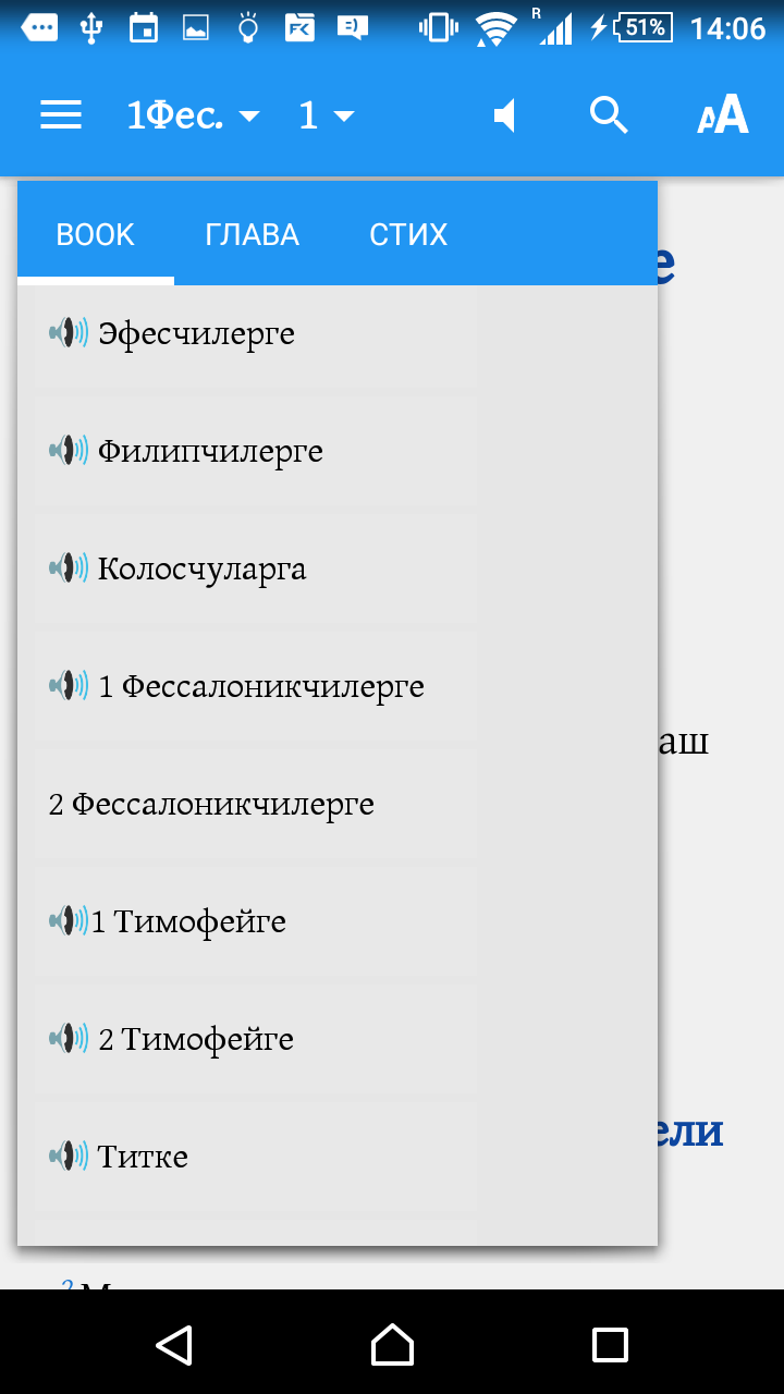
Can the book button in the book selector be wider to make use of all the space that’s there?