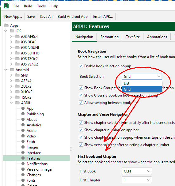
Currently there is not enough space in the chapter selector to display everything we want. If it were 3 or 4 columns wide rather than 5 it would be helpful.
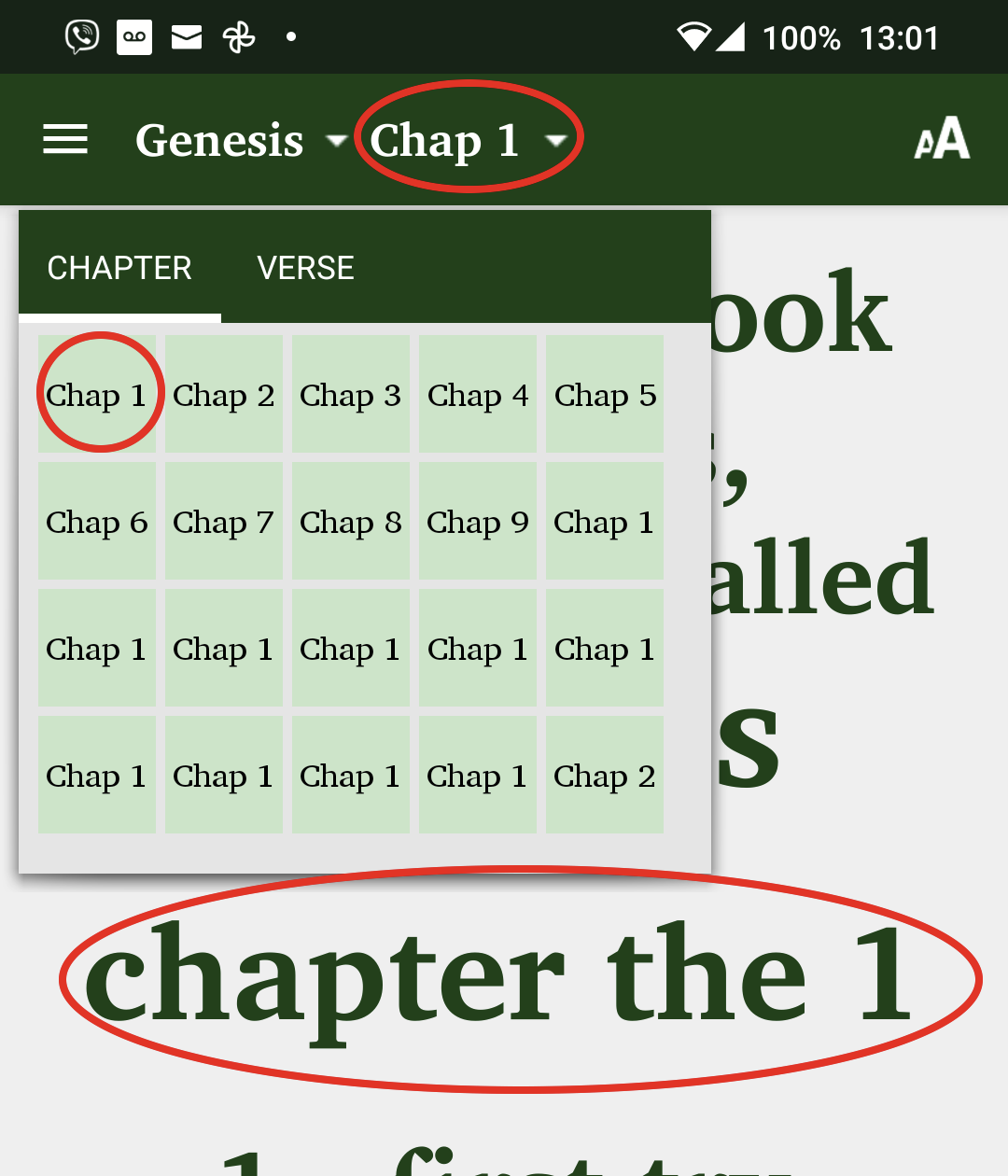
[Note that 5 columns is certainly a good default, so I’m requesting to have the option for other numbers of columns, not for a permanent change that affects all projects.]
See the full discussion here