I have two questions about the ui.drawer.
-
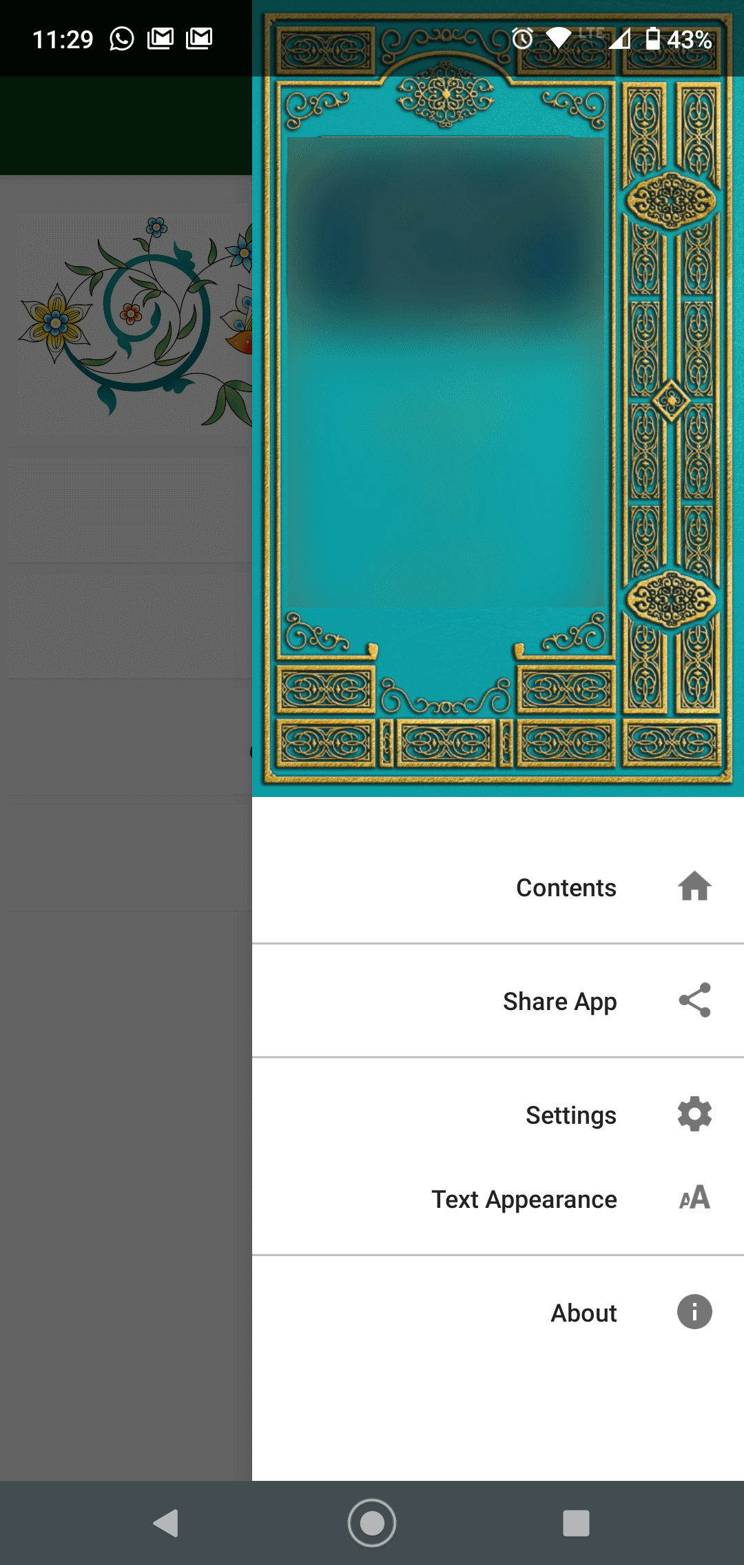
In the picture below, you will see the Android status bar overlays the picture on the top of the screen. It doesn’t cover up any other part of the app (like text or headers). Is there a way to turn that off, so the picture starts below the status bar?
-
Is there a way to narrow the width of that drawer, in this case so it’s as wide as the “Text Appearance” line? On my high-resolution phone things are okay, but on other users phones you have to scroll to get to the bottom options.
I know the picture ratio is non-standard, but I think the two questions are independent of that fact.