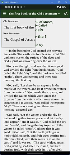
The dropdown list used for navigation and changing books/chapters/verses is too narrow by default, and I can’t find any way of making it wider. So my question is, Is it possible to make this wider?
See this picture of an exaggerated example.
Note that turning on “Show chapter selector immediately after the user selects a book” makes that area slightly wider, but it also (obviously) adds a “CHAPTER” tab into the selection pane. The actual project I’m working on has a series of one page “books”, so they’d prefer to not have “CHAPTER” show up as an option.
Also, I suspect the design decisions were made on the assumption that this list would either have abbreviations or simplified book names (“Matthew” rather than “The gospel according to Matthew”). But in the project I’m working on, at least 3 or 4 words are necessary to explain what that is.
I could turn off navigation altogether and use a Contents menu, but that makes navigation much more complex for what should otherwise be an extremely simple app.
